Guide
How do you check the lettering of a translated chapter?
Read every page at phone size next to the source, then check each balloon: the text fits with about a letter's width of air, the tail points at the speaker, balloons read in order, emphasis follows comic grammar, sound effects follow one rule, names match the series bible, spelling is clean and the font licence covers the use. The list below gives each check a reason.
Table of contents
This is the check after typesetting, before the chapter goes to the publisher or the platform. It does not teach lettering. How to Letter a Webtoon and the typesetting guide do that. Work in two passes: one fast pass per page at reading size, then one slow pass per balloon. The comic grammar comes from two letterers' published references, opened on 20 November 2026: Blambot's Comic Book Grammar and Tradition and Comicraft's Glossary of Lettering Terms on Balloon Tales.
Fit and placement
- Every line sits inside its balloon with air on all sides. Comicraft calls this space "air" and suggests about one letter width. Text that touches the edge is "gridlock".
- The text block follows the balloon's shape. A round balloon takes a round block, not an hourglass or a box.
- One size for normal speech across the chapter. A balloon that is bigger or smaller than its neighbours reads as a shout or a whisper.
- No text stretched or squashed to fit. Re-break the lines or ask for a bigger balloon instead.
- No balloon edge sits on a line of the art or the panel border. Comicraft calls this a tangent. It makes the balloon read as an object in the scene. Move it a little.
- Balloons cover no faces, hands or key objects. Comicraft defines placement as leading the reader's eye from panel to panel without covering figures or key objects.
- A single word alone on the top or bottom line is fine. Comicraft says widows are acceptable at the top or bottom of a balloon. A lone word in the middle is not.
Tails and reading order
- Each tail points at the speaker's mouth. Blambot says a tail should end at roughly 50 to 60% of the distance from the balloon to the head.
- Tails follow a curve from the balloon's centre toward the mouth. Comicraft's Creating Tails and Joins describes this "invisible curve".
- Thought balloons have a tail of small circles pointing at the head, as Blambot describes.
- Balloons read in the order the source intends. English balloons read left to right and top to bottom, and Comicraft puts the tail on the leftmost balloon of a pair so readers know at once who speaks. A manga that keeps its right to left page order keeps its source balloon order.
- No tail crosses another tail. Crossed tails make readers guess who speaks.
- Joined balloons (one speaker, two beats) stay joined. A split pause in the source is a split pause in the translation.
Comic grammar
These are the American conventions most English comics and manga releases follow. Check them line by line, or search the script for the characters.
| Check | Rule | Source |
|---|---|---|
| Interrupted speech | A double dash, exactly two dashes, only when speech is cut off. American comics use no em or en dash. | Blambot |
| Trailing speech | An ellipsis of exactly three periods. If the line goes on in the next balloon, end and start with one. | Blambot |
| Double dash or ellipsis | They are not interchangeable. Cut off is a dash, fading out is an ellipsis. | Blambot |
| Emphasis | Bold italic on the stressed word. There is almost no plain bold in dialogue. | Blambot |
| The crossbar I | Only for the pronoun "I" and in acronyms. The plain I everywhere else. | Blambot |
| Shouted question | "?!" only for a shouted question, with the question mark first as a loose rule. | Blambot |
| Whisper | Traditionally a balloon with a dashed stroke. Grey text, small text or italics are newer options. Pick one for the series. | Blambot |
| Breath marks | Three short strokes on each side of a non-word sound such as a sigh or a gasp. Comicraft calls them fireflies. | Blambot, Comicraft |
Fonts and licences
- One dialogue font for the series, with its bold italic for stress. A font change mid-series looks like an error.
- The font has every character the language needs. Many free comic fonts lack accented letters, the ellipsis or the tilde. Missing glyphs fall back to another font. See free lettering fonts.
- The licence covers this use. Blambot's free fonts for indie comics allow flattened web images "even if you are making money", but a comic from a mainstream publisher needs a paid licence. Read the font licence entry.
- OFL fonts are fine in sold images. The SIL OFL FAQ says a graphic made with an OFL font is not itself subject to the OFL.
- The font file goes with the delivery only if the licence allows it. Send the font name and source, not the file, when in doubt.
Size for each platform
Lettering that reads at your working size can be too small after export. Export scales the whole strip, so the text scales with it. The figures below use widths from the platforms' help pages, checked 20 November 2026.
| Export for | Width | A 24 px line from an 800 px master becomes |
|---|---|---|
| WEBTOON CANVAS | under 800 px | 24 px |
| Naver 도전만화 | exactly 690 px | about 21 px |
| Tapas | 940 px | about 28 px, but upscaled and softer |
| LINE Manga Indies, Jump Rookie | 800 px recommended | 24 px |
- Standard text is inside 12 to 30 px at the upload width. The WEBTOON handbook says most creators use this range. Check the smallest text at 690 px if you export for Naver.
- Export each platform from a master wider than its upload width. Scaling down keeps lettering sharp, scaling up blurs it. See webtoon sizes.
- Read one full page on a real phone before you sign off.
Sound effects
- Every sound effect follows the series rule: redrawn in the target language, kept with a small caption, or left. Mixed rules look like misses.
- A redrawn sound effect keeps the size, angle, colour and outline of the original, so it still reads as part of the art.
- Each sound effect means what the source means. Check the reading in an SFX dictionary, because a misread sound becomes a wrong word.
- No source letters are left half erased around a redraw.
Words, names and consistency
- Names, places and forms of address match the [series bible](/glossary/series-bible). One spelling per name, the same honorific choice every time.
- Run a spell check on the script, not only on the page. Add the bible's names to the dictionary first, so real errors stand out.
- Each character keeps their voice. A rough speaker does not turn polite in one balloon. See consistent character voice.
- Repeated lines read the same. A catchphrase changes only when the source changes it.
Compare with the source
- Count the balloons. Every source balloon has a translated one, and no balloon is empty.
- No source text is left in balloons, captions, signs, phones or notes that the series rule says to translate.
- Side text and small text outside balloons are lettered too, or listed as kept on purpose.
- Line breaks do not change the meaning, for example a joke whose punch word moved to the wrong balloon.
- The final page matches the approved script. Check that late edits reached the page.
Credits
- The letterer is credited as agreed, next to the translator and the original creator.
- Credits required by a font or an image licence are present.
How Bublate fits this check
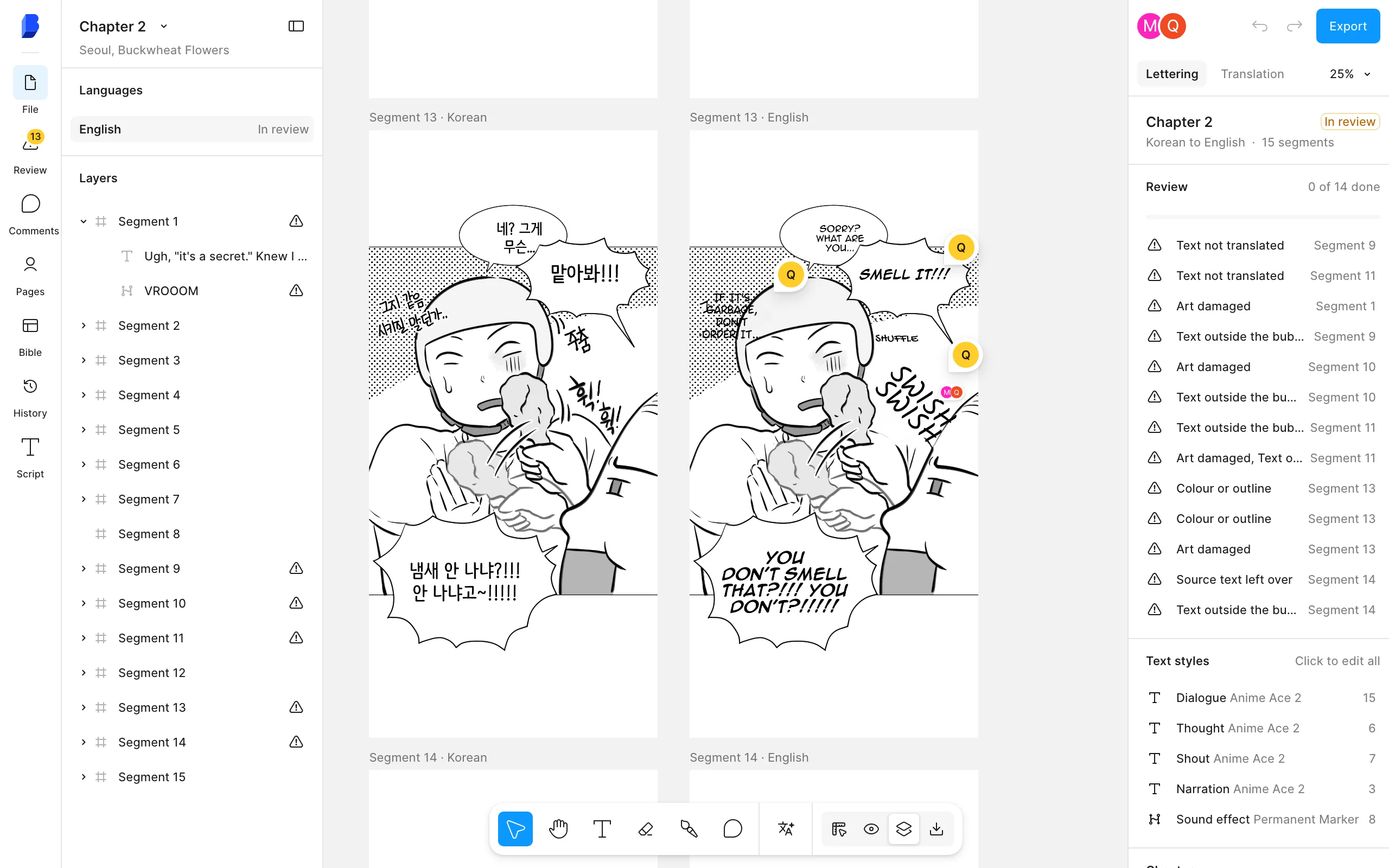
Bublate letters the first pass: it fits each line to the balloon, picks a style for shouts, whispers and thoughts, redraws sound effects and keeps names in the series bible. The checks above stay with a person. The editor helps with them: side by side review against the source, review flags per page, a script view with find and replace, edit history, and a compare view against the first pass. A quality check by someone other than the letterer still finds the most.
Frequently asked questions
What is lettering QA?
Lettering QA is the check of the lettered pages before release. A checker reads each page against the source and the script and looks for fit, tail, order, grammar, font, size, sound effect and name errors. In scanlation groups it is often called the quality check, or QC.
Should comic lettering use an em dash?
Not in American comic lettering. Blambot's grammar guide says there is no em or en dash in American comics. Use a double dash, exactly two dashes, for interrupted speech, and an ellipsis of three periods when speech trails off.
When do you use bold in comic lettering?
For a stressed word, use bold italic. Blambot says there is almost no plain bold in comic dialogue. Keep emphasis to the words the source stresses, and use the same style for it through the whole series.
What is the crossbar I in lettering?
A capital I with serifs at the top and bottom. Blambot says to use it only for the pronoun "I" and in acronyms, and the plain vertical stroke everywhere else. Using it inside other words is a common error in new lettering.
How much space should text have inside a balloon?
About one letter width on every side. Comicraft's glossary calls this space air, and calls text that touches the edge gridlock. If the text does not fit with air, re-break the lines or make the balloon bigger, rather than shrink the text.
Sources
- Blambot, Comic Book Grammar and Tradition · checked
- Comicraft (Balloon Tales), The Comicraft Glossary of Lettering Terms · checked
- Comicraft (Balloon Tales), Creating Tails and Joins · checked
- Blambot, Licences · checked
- SIL, OFL FAQ · checked
- WEBTOON, Creators Resource Handbook (PDF), section 7 and text size · checked
- Naver Help, 도전만화 등록 방법 · checked
- Tapas, Creating a comic episode (creator guide) · checked